1 Data, Patterns, and Models
Open the live notebook in Google Colab or download the live notebook
.Broadly, machine learning is the science and practice of building algorithms that learn patterns from data. Here are two synthetic examples of data in which there is some kind visually clear pattern in the data. In the first example (Figure 1.1 (a)), we can see that there is a relationship between two quantitative variables, \(x\) and \(y\). If someone told is the value of \(x\), then we would likely be able to make a reasonable prediction about the value of the number \(y\). This is an example of a regression task. In the second example (Figure 1.1 (b)), we can observe a relation between the location of each data point in 2d space and a color, which could represent a category or class. If someone told us the location of the point in 2d space, we would likely be able to say which of the two classes it belonged to. This is an example of a classification task.
Show code
import numpy as np
from matplotlib import pyplot as plt

plt.style.use("seaborn-v0_8-whitegrid")

def plot_fig(pattern = False):

    # panel 1: regression

    fig, ax = plt.subplots(1, 1, figsize = (6, 3))
    noise = 0.3

    x = np.arange(0, np.pi, 0.01)
    y = 2*np.sin(x) + 0.5
    y_noise = y + np.random.normal(0.0, noise, size = (len(x),))

    ax.scatter(x, y_noise, s = 20,  facecolors='none', edgecolors = "darkgrey", label = "data")
    if pattern:
        ax.plot(x, y, label = "pattern", linestyle = "--", color = "black", zorder = 10)
    ax.set(xlabel = r"$x$", ylabel = r"$y$")
    ax.set_xlim(-0, np.pi)
    ax.set_ylim(-0, np.pi)
    ax.set_aspect('equal')
    plt.legend()
    plt.show()

    # panel 2: classification

    noise = 0.2
    n_points = 300

    fig, ax = plt.subplots(1, 1, figsize = (6, 3))
    for i in range(2):
        x = i + np.random.normal(0.0, noise, size = n_points)
        y = i + np.random.normal(0.0, noise, size = n_points)

        ax.scatter(x, y, s = 20,  c = i*(np.zeros_like(x) + 1), facecolors = "none", edgecolors = "darkgrey", cmap = "BrBG", label = f"Category {i+1}", vmin = -1, vmax = 2)

    if pattern:
        ax.plot([-0.5, 1.5], [1.5, -0.5], label = "pattern", linestyle = "--", color = "black", zorder = 10)
    plt.legend()
    ax.set(xlabel = r"$x_1$", ylabel = r"$x_2$")
    ax.set_xlim(-1.0, 2.0)
    ax.set_ylim(-1.0, 2.0)
    ax.set_aspect('equal')
    plt.show()

plot_fig()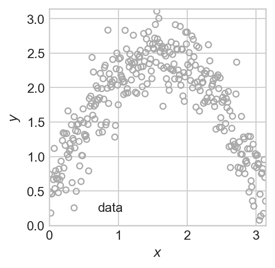
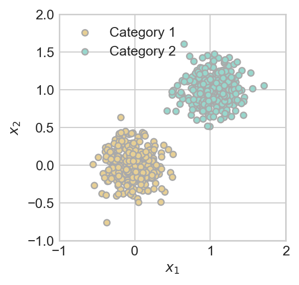
In examples like these, it’s often possible for us to just use our eyes and spatial reasoning in order to make a reasonable prediction.
How do we encode this knowledge mathematically, in a way that a computer can understand and use? In each of the two cases, we can express the pattern in the data as a mathematical function.
- In the regression example (Figure 1.1 (a)), we can encode the pattern in the data as a function \(f:\mathbb{R} \rightarrow \mathbb{R}\) that accepts a value of \(x\) and returns a modeled or predicted value of \(y\). Such a function is shown in Figure 1.2 (a). The function \(f\) is our predictive model. We often write \(y \approx f(x)\) to express the qualitative idea that \(f\) models the relationship between \(x\) and \(y\) in a given data set. We’ll learn how to make this idea much more precise when we study empirical risk minimization later in the notes.
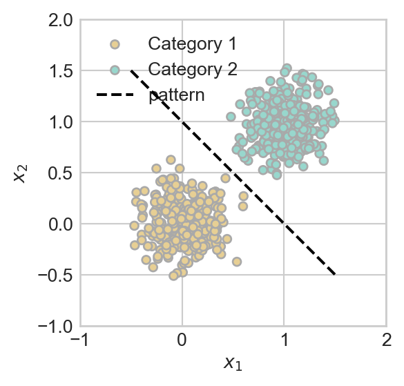
- In the classification example (Figure 1.1 (b)), we can again encode the pattern in the data as a function. This time, our model is going to describe an estimated **boundary* between the two classes of points. In this example, a linear boundary is pretty good. The plot shows the plot of the linear equation \(x_2 = g(x_1) = 1 - x_1\). Later in the course, it will be convenient to instead write this equation in the equivalent form \(\langle \mathbf{x}, \mathbf{w} \rangle = 0\), where \(\mathbf{x} = (x_1, x_2, 1)^T\) and \(\mathbf{w} = (1, 1, -1)^T\).
Show code
plot_fig(pattern = True)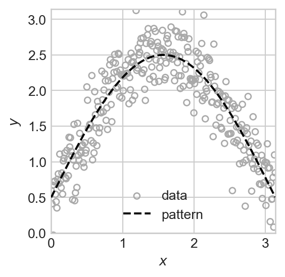
Supervised Learning
Our focus in these notes is almost exclusively on supervised learning. In supervised learning, we are able to view some attributes or features of a data point, which we call predictors. Traditionally, we collect these attributes into a vector called \(\mathbf{x}\). Each data point then has a target, which could be either a scalar number or a categorical label. Traditionally, the target is named \(y\). We aim to predict the target based on the predictors using a model, which is a function \(f\). The result of applying the model \(f\) to the predictors \(\mathbf{x}\) is our prediction or predicted target \(f(\mathbf{x})\), to which we often give the name \(\hat{y}\). Our goal is to choose \(f\) such that the predicted target \(\hat{y}\) is equal to, or at least close to, the true target \(y\). We could summarize this with the heuristic statement:
\[ \begin{aligned} \text{``}f(\mathbf{x}) = \hat{y} \approx y\;.\text{''} \end{aligned} \]
How we interpret this heuristic statement depends on context. In regression problems, this statement typically means “\(\hat{y}\) is usually close to \(y\)”, while in classification problems this statement usually means that “\(\hat{y} = y\) exactly most or all of the time.”
In our regression example from above, we can think of a function \(f:\mathbb{R}\rightarrow \mathbb{R}\) that maps the predictor \(x\) to the prediction \(\hat{y}\). In the case of classification, things are a little more complicated. Although the function \(g(x_1) = 1 - x_1\) is visually very relevant, that function is not itself the model we use for prediction. Instead, our prediction function should return one classification label for points on one side of the line defined by that function, and a different label for points on the other side. If we say that blue points are labeled \(0\) and brown points are labeled \(1\), then our predictor function can be written \(f:\mathbb{R}^2 \rightarrow \{0, 1\}\), and it could be written heuristically like this:
\[ \begin{aligned} f(\mathbf{x}) &= \mathbb{1}[\mathbf{x} \text{ is above the line}] \\ &= \mathbb{1}[x_1 + x_2 \geq 1] \\ &= \mathbb{1}[x_1 + x_2 - 1\geq 0]\;. \end{aligned} \]
This last expression looks a little clunky, but we will soon find out that it is the easiest one to generalize to an advanced setting.
Here, \(\mathbb{1}\) is the indicator function which is equal to 1 if its argument is true and 0 otherwise. Formally,
\[ \begin{aligned} \mathbb{1}[P] = \begin{cases} 1 &\quad P \text{ is true} \\ 0 &\quad P \text{ is false.} \end{cases} \end{aligned} \]
© Phil Chodrow, 2025